Winery Facade, Forli, Italy
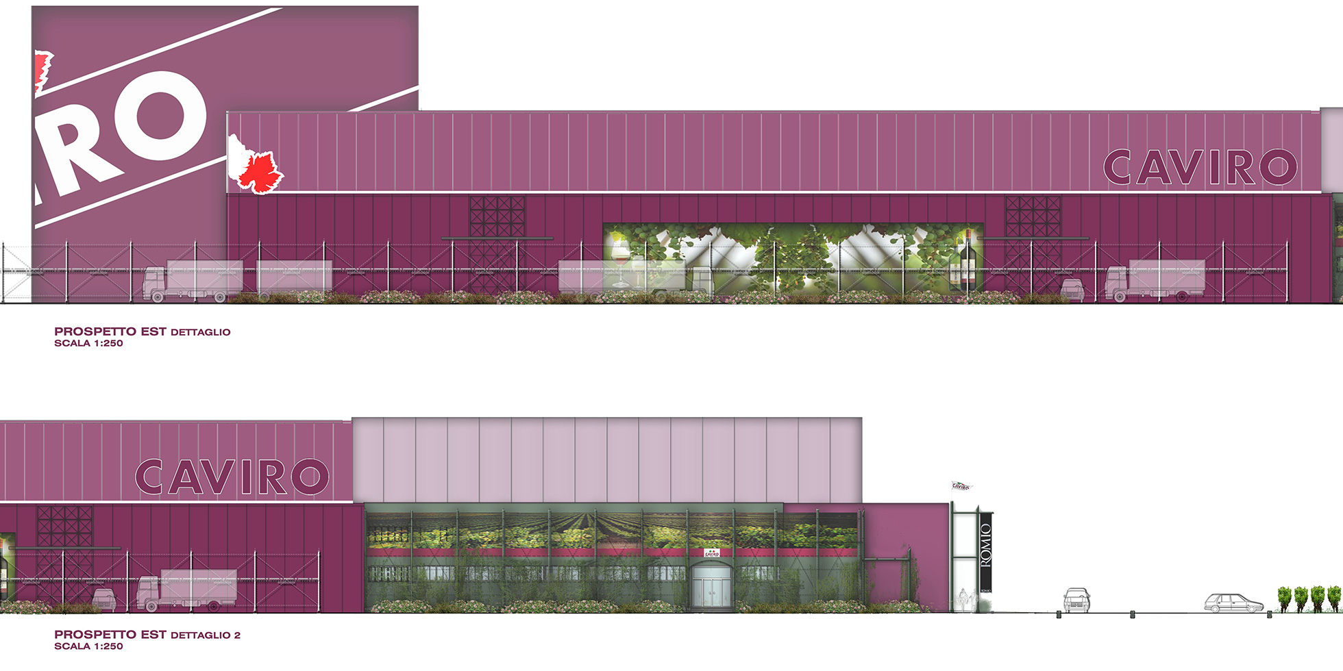
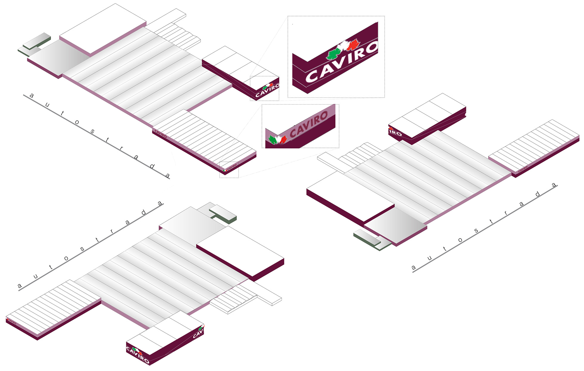
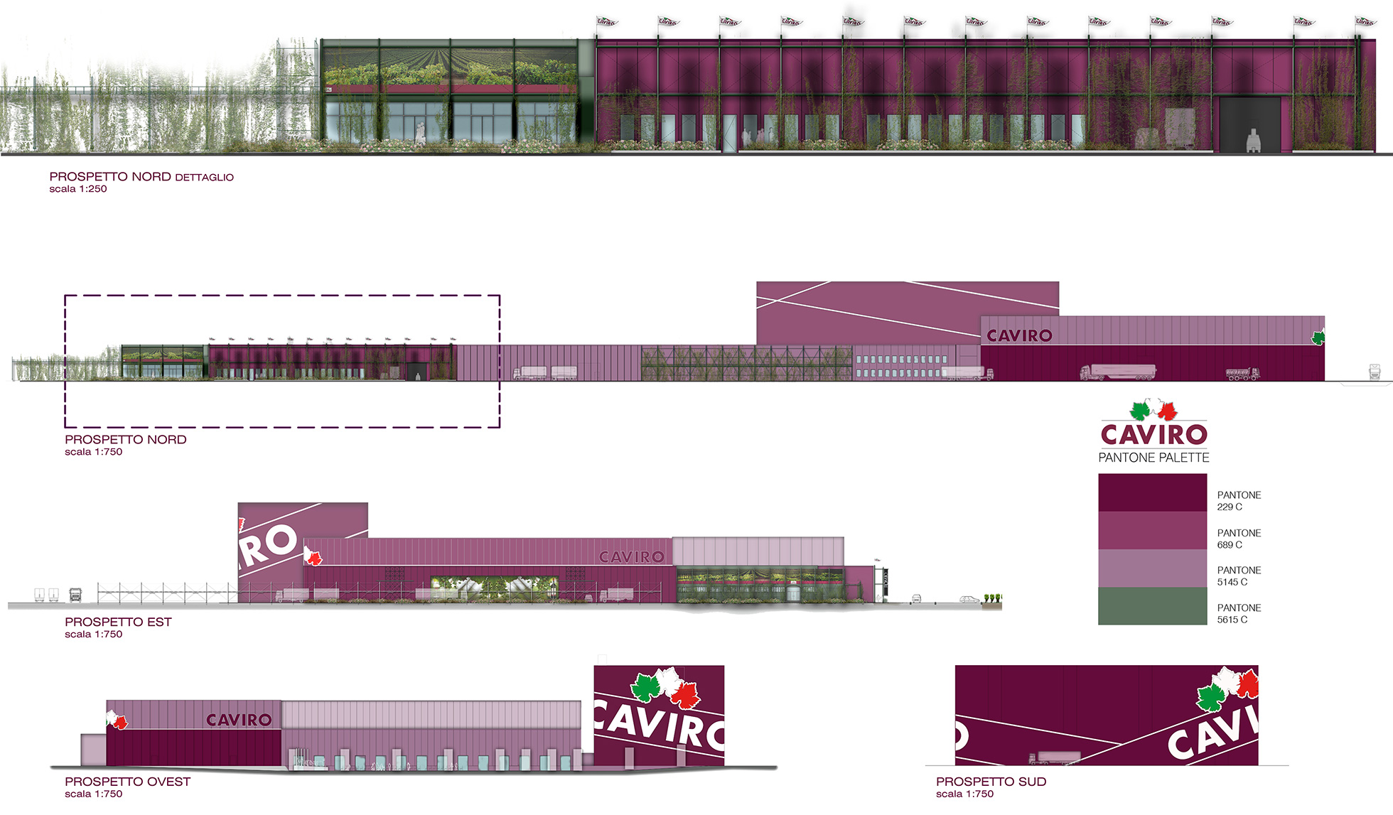
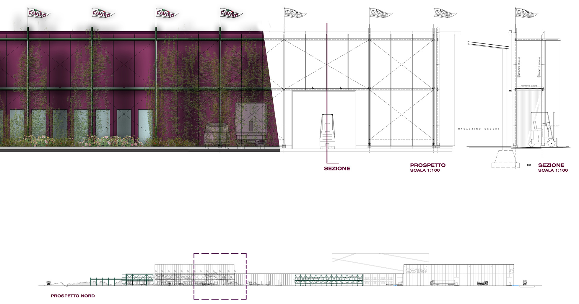
200 meters along the highway, the wine factory is presented with an extraordinary opportunity to communicate their brand that can be seen by millions of people a year. The need to get the attention of the observer must be combined with the proper visual guidelines which require a graphic that will not be distracting to the people driving by. The treatment of the facades pays particular attention to the areas that face the highway, in respect with the main visual value of the company while keeping the color scheme and advertising.The most pronounced graphic is far from the “Adriatica”. The warehouses are cladded with a graphic that resembles a wrapped present wherein you can see the branding come into play on the façade. The different shades of wine accentuate a complex volume. Simultaneously, the new “skin” evokes the world of wine with a subtle irony – a reference to the grape is incorporated into the color palette of the graphic design; it becomes a playful pretext for temporary events in the vineyard with permanent sculptural installations that also provide an interactive landscape.
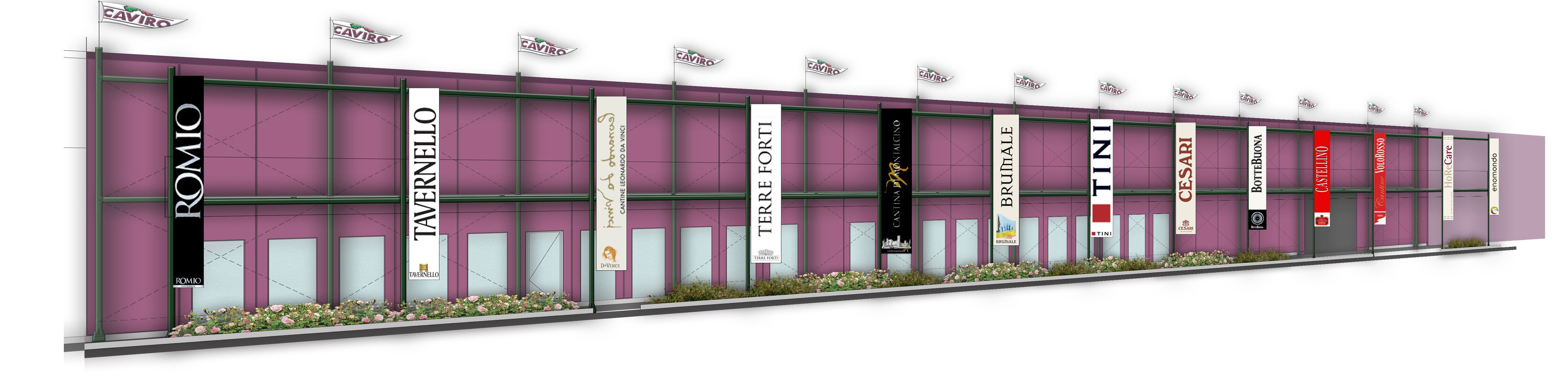
The re-naturalization of the industrial environment, long before sustainability dominated the corporate communication needed to be updated. Being ” green” is not just more than a competition, even for a company that has combined sustainability with business efficiency. The desire to make the soul of the brand purely green. The completion of the plant façade in front of the canteen, workshops, storage crates expresses the dynamic spirit of the 12,000 winegrowers that are associated with the company.
Location
Scope
Corporate Image Facade Design
Year
2016
In Collaboration with
Category
Commercial